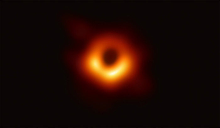
The first-ever direct image of a black hole's event horizon was a truly impressive feat of scientific ingenuity. But it was extremely difficult to achieve, and the resulting image was relatively low-resolution.
Techniques and technology will be refined, and it's expected that future direct images of black holes will improve with time. And a new NASA visualisation - made for the agency's Black Hole Week - shows what we might expect to see in high-resolution images of an actively accreting supermassive black hole.
Supermassive black holes sit at the centres of most large galaxies, and how they got there is a mystery; which came first, the black hole or the galaxy, is one of the big questions in cosmology.
What we do know is that they are really huge, as in millions or billions of times the mass of the Sun; that they can control star formation; that when they wake up and start feeding, they can become the brightest objects in the Universe. Over the decades, we have also figured out some of their strange dynamics.
 First-ever direct image of a black hole, M87*. (EHT Collaboration)
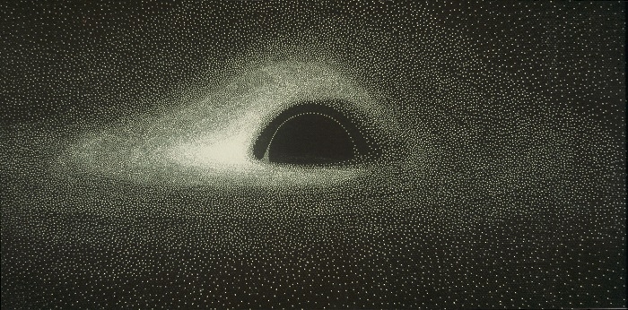
In fact, the very first simulated image of a black hole, calculated using a 1960s punch card IBM 7040 computer and plotted by hand by French astrophysicist Jean-Pierre Luminet in 1978, still looks a lot like NASA's simulation.
In both simulations (the new one above, and Luminet's work below), you see a black circle in the centre. That's the event horizon, the point at which electromagnetic radiation - light, radio waves, X-rays and so forth - are no longer fast enough to achieve escape velocity from the black hole's gravitational pull.
 (Jean-Pierre Luminet)
Across the middle of the black hole is the front of the disc of material that is swirling around the black hole, like water into a drain. It generates such intense radiation through friction that we can detect this part with our telescopes - that's what you are seeing in the picture of M87*.
You can see the photon ring, a perfect ring of light around the event horizon. And you can see a broad sweep of light around the black hole. That light is actually coming from the part of the accretion disc behind the black hole; but the gravity is so intense, even outside the event horizon, that it warps spacetime and bends the path of light around the black hole.
You can also see that one side of the accretion disc is brighter than the other. This effect is called relativistic beaming, and it's caused by the rotation of the disc. The part of the disc that is moving towards us is brighter because it is moving close to light-speed. This motion produces a change in frequency in the wavelength of the light. It's called the Doppler effect.
The side that's moving away from us, therefore, is dimmer, because that motion has the opposite effect.
"It is precisely this strong asymmetry of apparent luminosity," Luminet wrote in a paper last year, "that is the main signature of a black hole, the only celestial object able to give the internal regions of an accretion disk a speed of rotation close to the speed of light and to induce a very strong Doppler effect."
Simulations such as these can help us understand the extreme physics around supermassive black holes - and that helps us understand what we are seeing when we look at the picture of M87*.
2019-09-26 02:59:14Z
https://www.sciencealert.com/this-new-nasa-visualisation-of-a-black-hole-is-so-beautiful-we-could-cry
Read Next >>>>
Bagikan Berita Ini


0 Response to "New NASA Visualisation of a Black Hole Is So Beautiful We Could Cry - ScienceAlert"
Post a Comment